Monthly Archives: August 2008

Back from the Bat Cave

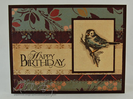
Hi, everyone!  That’s where I feel like I’ve been…in a cave.  It’s been pretty dark and very, very quiet.  My son’s surgery went well.  Wednesday was a bit rough, but yesterday was much better.  He had his post-surgery check and the doctor says his eyes look great.  I’ll have to take her word for it though as his eyes seriously make me ill.  (My stomach handled the seventeen stitches in the back of his head last year much better.)  Thank you all so very much for your kind thoughts, well wishes and emails.  I truly appreciate each and every one of them. 

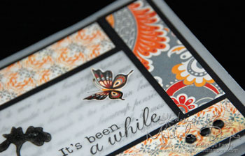
So…I’ve had this image stamped and ready for color for a while.  It’s my all-time favorite (quite old Stampin’ Up) Halloween set.
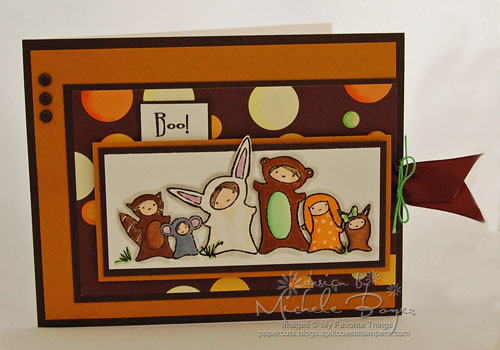
Happy Halloween

HHST

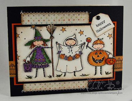
I used Copic markers to color the image.  I cut the (hat) star and pumpkin pail ‘out of the box’ then sponged the edges to dirty them a bit.  You can’t tell in the photo, but I used a clear glaze pen on the trick or treat bag, hat star, garland, caramel and pumpkin pail.

HHCUST3

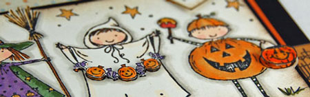
I popped up the trick or treat bag, garland and pumpkin pail, placing a rolled glue dot beneath each pumpkin on the garland and a tiny dot of glue under the first and last candy in the string. 

Cardstock:  Prism Natural Smooth, Black, Papaya Puree Dark   Patterned Paper:  Imagainisce Hallowhimsy “Eat, Drink and Be Scary” and “Wicked Whimsy”   Stamps:  Stampin’ Up! Sweeter Treaters and Everyday Flexible Phrases   Ink:  Adirondack Pitch Black, Ranger Walnut Stain Distress   Accessories:  Copic markers, Sakura clear gel pen, mm brad, glue dots, pop dots, sewing machine, sponge. Card size 5 ½” x 4 ¼”.

Thanks so much for stopping by and have a SUPER day!

m.

p.s.  SALE at Jacksonbelle Embellishment today through Monday night.  15% off everything in the store with code LABOR08.

The Two-Day Card

I’m a slow stamper.  I know that.   I rarely “whip up” a card in an instant.  But I hate when one takes two days.  Why should a card take two days?!  Is it really worth the effort?  Sometimes.   It depends on the recipient.  It depends on how much time you have on hand, whether your tools are in working order and how many mistakes you make.  (Do you sense trouble coming?)

It’s Been a While

 IBAWB

Today’s challenge at Cornish Heritage Farms is to use vellum cardstock.   After a lot of trial and error (emphasis on the “error” as I think I used six sheets of vellum), I decided to use the vellum as my base.  I added the matted strips of Basic Grey’s new Ambrosia and stamped the flower and sentiment from Silhouette Blooms II onto the center “window.”  The ink takes a bit of time to dry but if you lightly zap it with a heat gun (one that WORKS), that will speed the process.  And you have to CAREFULLY dry the ink or your vellum will warp and you’ll have to either start over or deal with a very bendy card.  (I’m sure you know how I know this.  On the brighter side, at least nothing caught on fire.)

I cut a second piece of vellum cardstock, stamped the French Script backgrounder and adhered that behind the window.  You may want to set the card aside before inking the backgrounder just in case you DROP it and have to start all over.   

To give the inside a more finished look, I added a white border to the inside front.  I also adhered a piece of white cardstock to the inside back (using glue dots) for a handwritten note.

       IBAWI

As a final touch, I cut one of the butterflies from the patterned paper, adhered only the center of the butterfly to the front window and bent up the wings.  So after a lot of wasted paper, too much time and a few choice words  , I was  happy with the result.

      IBAWCU2

Check out these other CHF designers to see what they did with vellum cardstock:

Kristine Reynolds

Carole Burrage

Kim Hughes

Julia Stainton

Lisa Silver

On a personal note, my son has his surgery tomorrow.  I’m nervous and stressed, as any mom would be.  I’m trying hard not to worry too terribly much and hoping tomorrow is a cake-walk compared to last summer.  I’m not looking forward to the surgery, but I am looking forward to all of this being over.  Hopefully this will be the last one.

Thanks so much for stopping by!  Have a great day!

Stamps:  Cornish Heritage Farms Silhouette Blooms II (Kim Hughes Collection), French Script Backgrounder   Ink:  Palette Noir Black by Stewart Superior   Paper:  Vellum cardstock; Prism Black, Super Smooth White; Basic Grey Ambrosia 6″ x 6″ paper pad   Accessories:  Brads (American Crafts). Card size:  5 ½” x 4 ¼”.

Hola, Mocha Chica!!!!

Tomorrow (Friday, August 22nd) is a big day for fellow CHF designer, Kim Hughes.  Friday brings from Cornish Heritage Farms Kim’s very own patterned paper pack, Mocha Chica and a corresponding mini-set by the same name. 

I’m so happy for her.  She’s such a STAR!!!   Big congrats, Kim! 

I haven’t had as much time to play as I’d like, but Kim’s new papers really are fun. 

Peep!

      P325 2

This is a corner of one of the pages.  The tree and lines were already on the paper. 

P CUI added a tiny bit of gray shading to the tree to make it look more 3-d, (I love the look of that), added the velvet brads and the little bird (from the Mocha Chica mini-set).   The bird was stamped onto a different pattern from the pack, cut out and adhered.

I added a bit of stitching in two of the corners and used a craft knife to make a slit on each side of the tree for the ribbon.

Stamps:  CHF “Pretty Birds” and “Mocha Chica” (Kim Hughes CollectionInk:  Adirondack Pitch Black   Cardstock:  Prism White (base)    Patterned Paper:  CHF “Mocha Chica” paper pack by Kim Hughes     Accessories:  Copic markers, velvet brads (Making Memories), ribbon (My Mind’s Eye), sewing machine.  Card size 4 ¼” x 5 ½”.
Hello

 CHFHP

This is my somewhat feeble attempt at a “Primitive” style.  It does not come easy to me (and maybe even not at all–please be kind).  I’ve always admired Julie‘s style, especially when she uses the Primitive-ish images but I have really struggled.

There are two sheets of each design in the Mocha Chica pack.  The paper I used here actually has four squares of the lined pattern in four different colors with four different images in the lower right corner.  Since I wanted to cover the whole card front, I used this square from both sheets, cutting the top from one and adhering it above the other to extend the length of the paper.  (Did that make sense?)  The seam is under the twill.

I used a black marker and a Stamp-a-ma-jig to split the sentiment, replacing the L’s with the bird’s legs.

Cardstock:  Prism White (base), Super Smooth White   Patterned Paper:  CHF Mocha Chica paper pack by Kim Hughes   Stamps:  CHF “Mocha Chica”and “Pretty Birds” (Kim Hughes Collection); “Primitive Christmas” (The Rummage Bin)   Ink:  Adirondack Pitch Black, Ranger Walnut Stain Distress    Accessories:  Black twill and gingham (scraps), safety pin (Spare Parts by Paper Studio), brad (American Crafts), Fiskars Scallop scissors, piercing template/needle, black marker, sewing machine.  Card size 4 ¼” x 5 ½”.
Thanks so much for stopping by!  I’ll have more samples using Kim’s Mocha Chica paper and mini-set soon!  Have a great day!

Little Sparrow, Little Sparrow

Just pretend I’m listening to David Cook…”little sparrow, little sparrow…”   I love what he did with that song (along with everything else he sang).  Anyway…

A fairly quick post from me today.  I’m shuffling children and this afternoon my son has his presurgery check-up with the pediatrician.  We met earlier this week with the surgeon, I have a couple more forms to fill out and a phone call or two to make and we’re ready for next Tuesday’s eye surgery.  I just want this to be over with.  I’m not liking this August pattern that has developed over the last two summers.  

Happy Birthday

hb-little-sparrow.jpg

This is one of my favorite images from Inkadinkado.  (You can find it here at Jacksonbelle Embellishments along with many new adorable Halloween images!)

It’s a bit hard to see in this photo, but I used my Nestabilities for the first time! I love them and want MORE!  I clipped around the tail feathers, going in with the scissors as far as the die would go, then just lifted the tail out before cutting and embossing.  Super easy!

I used Copic markers to color the image, outlining with two shades of gray.

After I zig-zagged those two lines of stitches, I decided I didn’t like the color so I lightly colored over the stitches with a gray marker.  (Much better.)

Thanks so much for stopping by!  Have a super Wednesday!!!

Cardstock:  Prism Vanilla Cream, Suede Brown Dark   Patterned Paper: Cosmo Cricket Gretel   Stamps:  Inkadinkado   InkAdirondack Pitch Black   Accessories:  Copic markers, rectangle Nestabilities, sewing machine.  Card size 5 ½” x 4 ¼”.

Cocoa Riley and his Parrot, Ruby

While browsing around CHA this summer, Lindsey, Trudee and I came upon the Hannah Stamps booth.  Kristi Ferro, the owner of Hannah Stamps, was so sweet and so generous to allow us each to choose a couple Riley images.  (I was very excited since I think they’re adorable and I didn’t have any!)  I couldn’t resist the pirate…although as crazy as Lindsey is about “The Captain,” I’m surprised she didn’t want this one.  She can have this card instead. 🙂

Where be de Captain?       

PRLB2

My color combo is from today’s color challenge at Splitcoast Stampers to use Ruby Red, Close to Cocoa and Blush Blossom.  As I only have one tiny scrap of Blush Blossom (and don’t really care to buy more), I used a peach marker on the parrot’s beak and Riley’s buckle.

I really tried to fit a clever sentiment on the front of this card, but I just couldn’t find a way to work it in so it’ll have to go on the inside.  (Maybe I’ll still stamp something in a bottom corner…I don’t know, but the card looks naked…like Riley.) 

I’m sure this is not an original idea, but I added whiskers to Riley’s face using a black marker.  (Pirates are supposed to be kind of dirty and scruffy, right?)  I scribbled in some grass with a black marker, and a black gel pen makes all eyes nice and shiny.

Thanks for stopping by!  Have a great day!

Cardstock:  SU Close to Cocoa and Ruby Red; Prism Natural Smooth    Patterned Paper:  7gypsies “Tanga,” “Bazrah” and “Gazi”   Stamps:  Hannah Stamps “Pirate Riley”  InkAdirondack Pitch Black   Accessories:  Copic markers, black gel pen (Sakura), Architexture Gothic Metal brad dots (EK Success), sponge, sewing machine.  Card size 5” x 5”.

‘Crooked, Run over and Brown’

That’s the answer I got when I asked my husband if this card looked ok.       (I knew he’d say that.)  Actually, these are my three favorite things to do when creating a card…stagger layers, distress and use brown.   (We tease my father-in-law about that being his favorite color but it’s mine too.  Shhhhh!)

Today’s challenge at Cornish Heritage Farms is to use our favorite product from the CHF store.  I didn’t hesitate in making my choice.

Special to Me

MYDB

Probably my most used ink, second to black, is Walnut Stain Distress ink by Ranger.  I don’t even bother to put it away.  It stays on my table with it’s dedicated wedge of sponge.

I used it here for the flower and Peeled Paint for the stem. Before stamping, I stamped off gently, once onto scrap paper, then stamped the image four times onto Natural Smooth cardstock without reinking between impressions.  I also used the Walnut Stain ink to sponge the edges of the focal piece.  (That ink makes the best dirty edges!!)    

Be sure to check out these other CHF designers to see their favorite product and what they did with it:

Julia            Alli                  Kristine            Kim 

Joanne       Dawn               Lori                  Sherrie      

Carole        Becky               Val                   Julie

KFWhile I was finishing my card, my daughter (she’s six) came into my room and asked if she could make a card for me.  I let her choose the paper and she told me which stamp set she wanted.  Here’s what she made.  Awwww….I love the little cards and drawings I find here and there that say “To Mom.  I love you.  From Katie.”  Before long I’ll be finding those notes less and less frequently so for now, each one is a treasure.   (Look at how straight that white paper is!  I think I have a little stamper in the making!)

Thanks so much for stopping by!  Have a great day!

Cardstock:  Prism Vanilla Cream (base), Wizard Dark, Natural Smooth   Patterned Paper:  My Mind’s Eye Wild Asparagus “Boy oh Boy” Dots and Plaid   Stamps:  CHF Silhouette Blooms I (Kim Hughes Collection) and Birthday Centers (Mona Lisa Moments)   Ink:  Ranger Walnut Stain and Peeled Paint Distress   Accessories:  Button (Tim Holtz Metalz), ribbon/ric-rac (May Arts), edge distresser, sponge, sewing machine.  Card size 5 ½” x 4 ¼”.

Trick or (a hidden little) Treat

I just can’t seem to resist cute little Halloween images.  (It’s a weakness.)  This one is called Monster Squad, a new release by My Favorite Things.  Had to have it!!!

 TOTMFT500

I started out with the intention of making this another regular card, but just before I adhered the focal image, I thought, “Hmmm…. I think I’ll hide a little treat back here.” 

        TOTPOR

So here’s what I did…I cut a piece of 2 3/4″ x 2 1/8″ patterned paper to cover a stick of gum,  folded the paper around the gum just to get the fold lines, then unfolded the paper.  I cut a piece of chocolate ribbon, folded it in half and stapled it to one end of one side of the paper, like this:

                  TOTSR

I wrapped and adhered the paper around the stick of gum then tied some string around the ribbon.  Mine was white but I colored it with a green Copic. 

Next, I laid the wrapped gum on the back side of the focal image, aligning the edge of the gum with the edge of the matted piece.  (Be SURE the ribbon is sticking out on the right side.  Don’t ask me why I’m warning you to double check.  Rolling Eyes)  Leaving a tiny bit of space on each side of the gum, apply foam tape across the bottom, top and side of the gum and then across the bottom edge.  I used the border strip from my foam squares.  (Sorry for the bad picture. I took that one at night.)

                       TOTFT

Adhere that piece to your card front and slide in the gum.  (Don’t pay attention to that skinny brown ribbon.  I decided it was too small and added the wider ribbon instead.)

Thanks so much for stopping by!!  Have a great day!   

Cardstock:  Prism White (base), Suede Brown Dark, Sunflowers Dark, Super Smooth White   Patterned Paper:  Memory Box “Spooky” Collection 6×6   Stamps:  My Favorite Things “Monster Squad” and “Fright Night” (boo sentiment)   Ink:  Tsukineko Memento Tuxedo Black   Accessories:  Copic markers, brads (American Crafts), black marker, white string, chocolate grosgrain, foam tape.  Card size 5 ½” x 4 ¼”.

Experimenting with Copics

Julia’s challenge today at Splitcoast Stampers is to use Copic markers.  I wanted to try something I hadn’t done before…coloring directly on the stamps with the Copics.

True Friend

HATF360

When I heard about this technique from Dawn (who I think heard about it from Gina K) I was so excited.  I’ve always loved the effect of coloring with markers on stamps but I had no idea you could do it with Copics. 

I colored the flowers here with a yellow Copic, then orange around the edges and finally brown on the stems.  Then I sprayed the markered stamp with rubbing alcohol and stamped!  LOVE IT (not necessarily THIS card, but the concept)!  My room smelled like the doctor’s office, but other than that, it worked great!

The background on the darker paper is one of the newer releases from Cornish Heritage Farms, Pinwheel.  (Just wanted to point that out because I like it so much.)

Thanks so much for stopping by!  Have a great day! 

Cardstock:  Prism Sugar Cream (base), Natural Smooth, Candle Glow Dark, Tawny Dark, Birchtone Dark   Stamps: Cornish Heritage Farms “Nature’s Silhouettes” (Kim Hughes Collection), “Friend Centers” (Mona Lisa Moments) and Pinwheel Backgrounder   Ink:  Ranger Adirondack Espresso and Walnut Stain Distress  Accessories:  Copic markers, rubbing alcohol (in a spritzer), ribbon, hemp, piercing template/needle, brown marker, sponge.  Card size 4 ¼” x 5 ½”.

Hey, it’s me!

Don’t you hate when you have new stamps and just don’t have time to use them?  I leave mine on my desk so I won’t forget I have them…and that way every time I walk in the room, the new stamps are sitting there, waiting…patiently… until I can finally get them inky.

Hey!

HIM3

I used Call Me by My Favorite Things.  I don’t know what it is about these MFT sets, but I always want to paper-piece them.  They’re just perfect for that technique.  It can be a bit tedious cutting out little feet or hands, but I’m always happy with the results.  Sometime I really should challenge myself to color one…but not today.  😉

Speaking of cutting out little feet or hands, I thought I’d share how I do that.  When I cut out the feet here, I carefully cut around each foot, but when I got to the ankles, I left a bit of extra paper on that end, tucking the excess under the pant legs.  I do that for all the smaller pieces if possible.  It’s a lot easier than trying to keep a tiny part in my hands, easier to align the piece with the base stamped image and adds just a bit of realistic dimension with the pant leg on top.

After piecing the image, I added shading with two gray Copic markers.  I punched the little flowers from the patterned paper, adhered them with the tiny brads and then I bent the little petals slightly forward.  To create the sentiment, I split two that came with the set, the”Hey, it’s been a while” and “Call me” sentiments.

Thanks for stopping by!  Have a great day!

Cardstock:  Prism White (base), Super Smooth White   Patterned Paper:  SEI Poppy 6 x 6 paper pad   Stamps:  My Favorite Things “Call Me”   Ink:  Adirondack Pitch Black   Accessories:  Copic markers, McGill tiny flower punch, Queen & Co. black Sprinkle brads, sewing machine.  Card size 4 ¾” x 4 ¾”.

Thomas Kinkade Paper Packs

I have been waiting and waiting for these papers…they are finally here!!!  Today Cornish Heritage Farms releases two Thomas Kinkade 8″ x 8″ paper packs, a Masculine series and a Christmas series.   (You can see the full packs here.)  Each pack includes background papers and images!  None of the images below were stamped.  I just cut them from the paper pack!!  🙂 

Birthday Wishes

BDWTKP

I’m sure you already know the Masculine series is my favorite!  I love the distressed look of these papers.   Both of the brown background papers are from the pack.  The lighter brown has a distressed leather look.  (I wish I could get a whole pack of just that one paper!  It looks awesome!)

The edges of the focal image and Natural cardstock were all sponged using Ranger’s Walnut Stain Distress ink.  The sentiment is from Mona Lisa Moments Classic Essential Expressions.  The eyelets are inserted through all layers on the front of the card so I could wrap the hemp without having a bulky lump between layers.

Peace on Earth

LTBPTKP

For this card I used both the Masculine and Christmas packs.  Obviously the focal image is from the Christmas pack.  But that distressed canvas paper is from the Masculine pack.  This is another background paper I love.  (And would love even more to have a pack of THIS paper in different colors, but then I am always drawn to the textiles.)

I lightly sponged the edges of the focal image and sentiment with Adirondack Slate ink and there’s a little pop dot under the outer edge of the tag just to add a tiny bit of dimension to the card.  Yellow/gold cardstock is Prism Candleglow Medium, button is by Autumn Leaves and ribbon by SEI.  Button is held in place using glue dots.

Go Confidently

GCTKP

This last card uses the Masculine paper once again.  Although this is not my favorite card of the three, this is one of my favorite images in the pack.  Maybe because when I was young(er-ha!) our family went out into the Chesapeake Bay on my grandparents’ boat just about every Sunday.  It wasn’t a sailboat, it was much bigger, but those are some treasured memories for sure.  **sigh**

Anyway, this is my husband’s least favorite of these cards…because it looks like it’s been in the road. Well, I like it.  I distressed the edges (what he hates most-lol) and then sponged with Adirondack Slate ink.

  • I use a lot of darker colors for my base cardstock so to avoid having to line the inside of the card with a lighter color, I prefer to cut the darker color to fit the card front and use either a sturdy vanilla or white as my base.

Thanks so much for stopping by!  If you’re a TK fan, I hope you’ll check out these papers.  They truly are beautiful.  Have a great day!

p.s.  My Cardinal friend was back yesterday.  That annoying bird was staring in the window watching the Olympics.  And pecking.  And pecking.  (Maybe he was cheering.  **eyes rolling**)