May 06 2008
The Direction of your Dreams
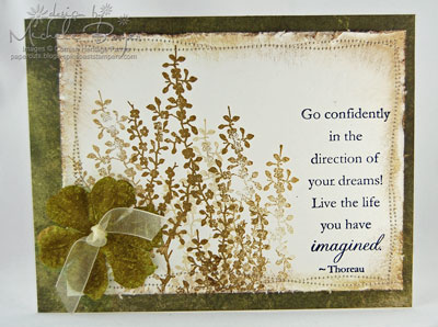
Today brings the release of three new sentiment sets at Cornish Heritage Farms, Birthday Centers, Friend Centers and Motivational Centers, all from the Mona Lisa Moments Collection . I’ve used Motivational Centers here.
Go Confidently
I wanted to keep this card fairly simple but I ended up doing more to it than I had intended. After stamping the green images (from Silhouette Blooms I, CHF) and the sentiment, I added the wonky stitching. But the card still looked too plain to me. So I sponged the edges. Hmmm… still not quite right so I distressed the edges.
Then I thought the card still needed some other element…a flower maybe? I consider myself to be totally Prima-challenged, so the thought even entering my brain was a little unsettling. :) I love how other people use flowers but when I add one to a card, I always think it looks stupid. And I’m still not so sure about this one. What do you think? I didn’t have the right color flower so I sponged this one with Oregano Adirondack ink to match the green images. Hmmm…I don’t know. Anyway, I love the flowers and the sentiment!
Thanks for stopping by! Have a great day!
Cardstock: Prism Natural Smooth Patterned Paper: Basic Grey Periphery paper pad Stamps: Cornish Heritage Farms “Silhouette Blooms I” (Kim Hughes Collection) and “Motivational Centers” (Mona Lisa Moments) Ink: Stazon Jet Black; Ranger Adirondack Oregano and Walnut Stain Distress Accessories: Prima flower, organdy, sewing machine, sponge, edge distresser. Card size 5 ½” x 4 ¼”.


Gorgeous!! The flower is perfect!
I LOVE IT!! The colours are beautiful, the flower is perfect and now I have to buy the stamp sets! - you are a fantastic salesperson!!
what a beautiful card. Love this sentiment
I think your flower is gorgeous! Works wonderfully! I love all the distressing on this card with the wonky stitching! I admire that look but can never seem to pull it off…I’ll continue to admire yours
Michele, I love the flower. I think it finished the card. Very pretty. TFS
Gorgeous!! CHF is so lucky to have you designing with these stamps! This is soooo Michele!! And you know I just love it when you stamp dirty flowers:)
Your card is beautiful and I think the flower looks great. Just the right touch.
The flower looks fine and is a great addition to the card.
This is stunning. Michele, I just made the connection between your blog name and the intended pun. Boy, am I slow!
Very nice Michele - I think it is a very “peaceful” card and I love the sentiment.
Michele, You are such an inspiration! I’ve been looking at your site for a week now and I LOVE everything I’ve seen. I’ve never heard of the stamping company you design for, but you have made it one of my favorites now.
I love this card, it’s absolutely beautiful! The flower is perfect!
This would make a beautiful graduation card. I must go get that stamp set!
Thanks for sharing your wonderful art and inspiring others such as me.
Just beautiful! love the stitching and distressed sponged edges - wonderful colors and sentiment!
I think the flower is perfect! I love the ribbon tied through the center. I love this stamping technique with the flowers. Your stitching and distressing are divine! And lastly the sentiment is great! Love the whole card!
I think the card is quite nice!! Not tooo much, BUT, just enough!! I can totally relate to the “Prima Challenged” issue. I always think my flowers look DUMB when I add one..however, seeing your card and knowing your are not too sure yourself…and I think everything you create is BEAUTIFUL and done with such TALENT…maybe I should try a bloom or two???
Thanks for the inspiration!!
Have A GREAT DAY!!!
1. you are NOT “Prima challenged”
2. when you add them, they NEVER look stupid.
3. YOUR CARD IS GORGEOUS!!!!
Your wonky, stitched edges are wonderful! That flower is perfect! It looks like velvet. I just want to reach into my computer screen to touch it!!! This is a gorgeous card!!! Quit second-guessing yourself!!!
I’d give it a 10…….PERFECT!
You did a fabulous job…stunning card!!
Ditto everyone, keep the flower. I think it works so well because you have coloured it to match so it blends instead of standing out giving it a lovely balanced look.
Absolutely gorgeous!! I love it all - the stitching, distressing and that pretty flower with the ribbon center!!
Beautiful!!!
Shell, you’ve nailed it…looks great, yes even the flower. Who said you can’t “do” flowers!
I can totally relate to you on the flower thing… except I have that trouble with sponging/distressing/flowers/ribbon/stitching/layering and everything else! lol I love your cards very much and get a lot of encouragement/inspiration from them. Thank you for sharing your talent with us
Gorgeous Michele!!
WOWZERS! That is beautiful!
Your prima doesn’t look stupid at all, it looks fabulous!
I have a really hard time with them myself, they never look exactly right. I’ll have to try coloring them in, working on changing the colors that looks fabulous!
I’m the exact same way with Primas! I always LOVE how they look on other people’s cards, but I can never seem to get them to work for me
Your card is lovely!
You and these CHF stamps look wonderful together, Michele! This is so calming. One of the things I love about the card is the matching color Prima–no worries–it looks great!
Oh my goodness! What a stunning card! So beautiful!
I love the flower, the sentiment, and the whole card. Beautiful! What a great graduation card. TFS.
I love this in monochromatic, all of your distressing & sewing…and your Prima is perfect!! Beautiful sentiment too!!